1. Context
I redesigned the Zameen.com landing page as part of the ACM UET course project. The vision was to create a cleaner, more user friendly property search experience that helps users find homes, plots, and commercial properties in Pakistan with less friction and visual noise.
2. Problem Statement
The original Zameen.com landing page felt overwhelming too much information presented at once, inconsistent UI patterns, and a layout that didn't guide the user clearly toward their goal of finding a property.
3. Project Overview
The Team
Zeeshan Ahmed — UI/UX Designer
Role
UI / UX Designer
Duration
1 Week
Tools
- Figma
4. Project Goal
The goal was to redesign the Zameen.com homepage to improve visual hierarchy, simplify property browsing, and create a modern, trustworthy experience for property buyers and renters in Pakistan.
5. Research Part
Persona
Profile: A typical Pakistani property seeker, age 25–40, medium tech level, uses apps like Daraz and WhatsApp daily.
Pain Points:
- Too many categories and options visible at once
- Hard to find relevant listings quickly
- Design feels outdated compared to modern real estate platforms
Analysis (Competitive Analysis)
I compared Zameen.com with Graana.com and Bayut.com. Bayut had a cleaner hero search experience while Zameen had stronger listing data. The gap was in visual clarity Zameen had the content but not the clean presentation.
Target Audience
Property buyers, renters, and plot investors aged 22–45 in Pakistan.
Target Audience Pain Points
- Cluttered above the fold layout
- Weak visual hierarchy on property cards
- Agency logos section feels unpolished
- Footer overloaded with links
6. Brainstorming & Ideation
Your Approach
After studying the original site and competitors, I identified the core issue: too much information trying to compete for attention at once. My approach was to simplify the hero, clean up the browse categories, and give the property cards more breathing room.
Possible Solution
Restructure the layout with clear sections, a stronger search CTA, and a minimal color system that builds trust.
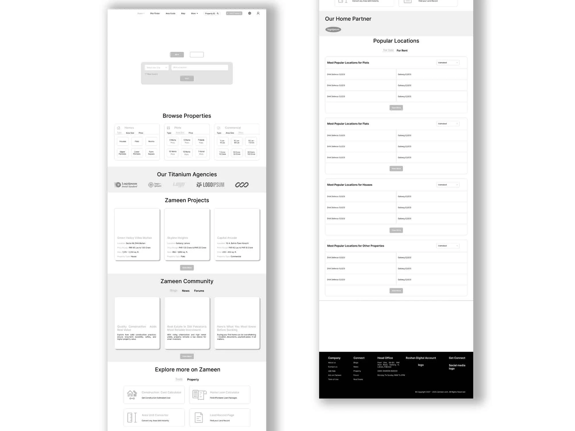
7. Wireframes
8. Final Designs (Mockups)
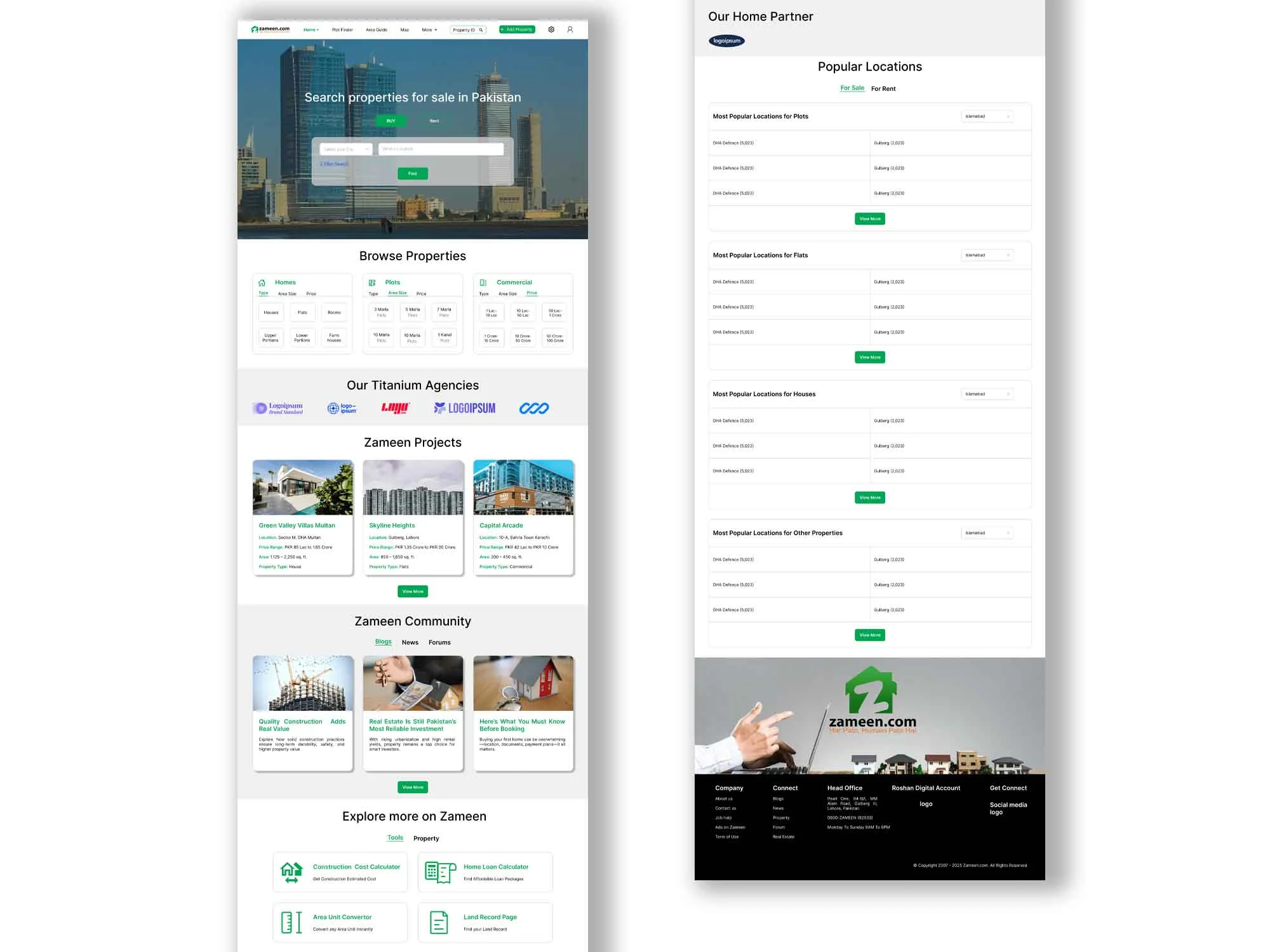
9. Design System & Style Guide
Typography
Clean sans-serif (Inter) - large bold for hero, medium bold for section headings, small regular for body and labels.
Colors
- Primary green for CTAs
- Dark navy for headings
- White backgrounds
- Light gray for sections
- Amber for price highlights
10. Conclusion
The main challenge was redesigning a real, well known Pakistani platform without losing its identity. I had to balance familiarity so existing users feel at home with modernization. The outcome was a cleaner layout with better visual hierarchy that guides the user naturally toward searching for a property.
I learned how to analyze an existing live product, identify UX flaws, and propose practical improvements rather than redesigning from scratch just for aesthetics.
11. Scope of Improvements
Map Integration
Adding an interactive map view for browsing properties by location would significantly improve the search experience.
AI Powered Recommendations
A "suggested for you" section based on browsing history could make the experience more personalized and reduce decision fatigue.