1. Context
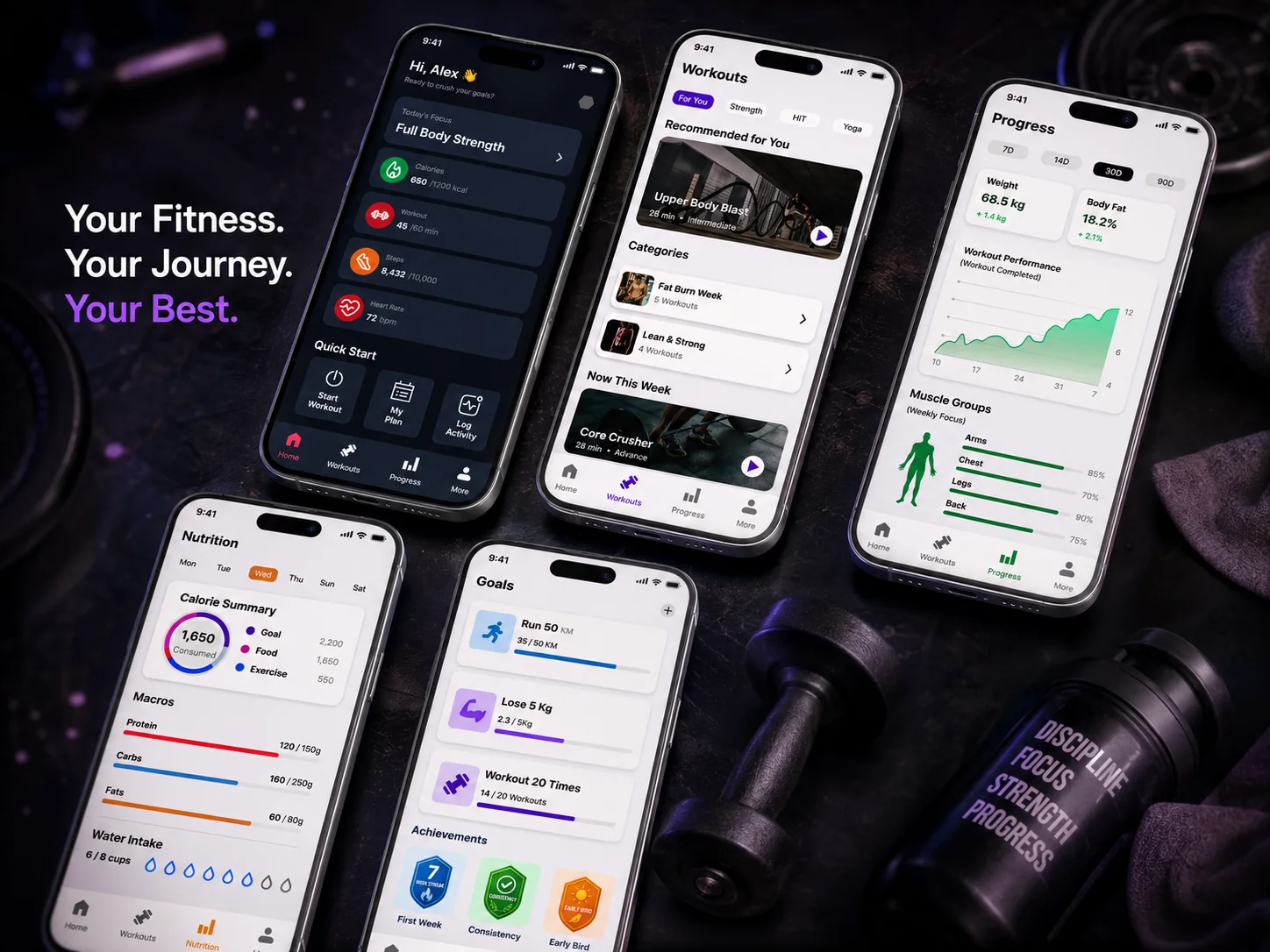
I designed a Fitness Tracker mobile app: "Your Fitness. Your Journey. Your Best." The vision was to create a dark-themed, motivating, and data rich platform that helps users track their workouts, nutrition, goals, and progress all in one place. The app focuses on personal fitness journeys without the noise of social comparison.
2. Problem Statement
According to the client, most fitness apps are either too simple or too complex. Users struggle to track workouts, calories, and progress together in one clean interface. There is no single app that feels personal, motivating, and easy to use daily.
3. Project Overview
Designer
Zeeshan Ahmed
Role
UI / UX Designer
Duration
1 Week
Tools
- Figma
- Claude
- Maze
4. Project Goal
To build a dark mode fitness app that allows users to track daily workouts, monitor nutrition macros, set personal goals, and view real progress in a clean, motivating, and distraction free experience.
5. Research Part
Persona: Alex
Age: 22–32
Tech Level: Medium–High (regular users of apps like MyFitnessPal, Nike Training)
Pain Points: Tracks workouts in one app, food in another, has no single view of overall progress.
Values: Motivation, simplicity, personal data ownership.
Analysis (Competitive Analysis)
I compared MyFitnessPal, Nike Training Club, and Strava. MyFitnessPal is strong on nutrition but weak on workout UX. Nike Training has great workouts but no nutrition tracking. Strava focuses only on running. This showed a clear gap for an all in one personal fitness tracker with a premium dark UI.
Target Audience
Age: 18–35
Demographics: gym goers, home workout users, health conscious individuals
Tech Level: medium high tech level
Target Audience Pain Points
- Switching between multiple apps for workouts and nutrition
- No single view to see overall fitness progress
- Generic content that doesn't feel personal
- Lack of motivation tracking and achievement system
Use Case Analysis
Created scenarios in Maze: starting a workout, logging nutrition, checking progress chart, setting a goal, and viewing achievements.
6. Brainstorming & Ideation
Your Approach
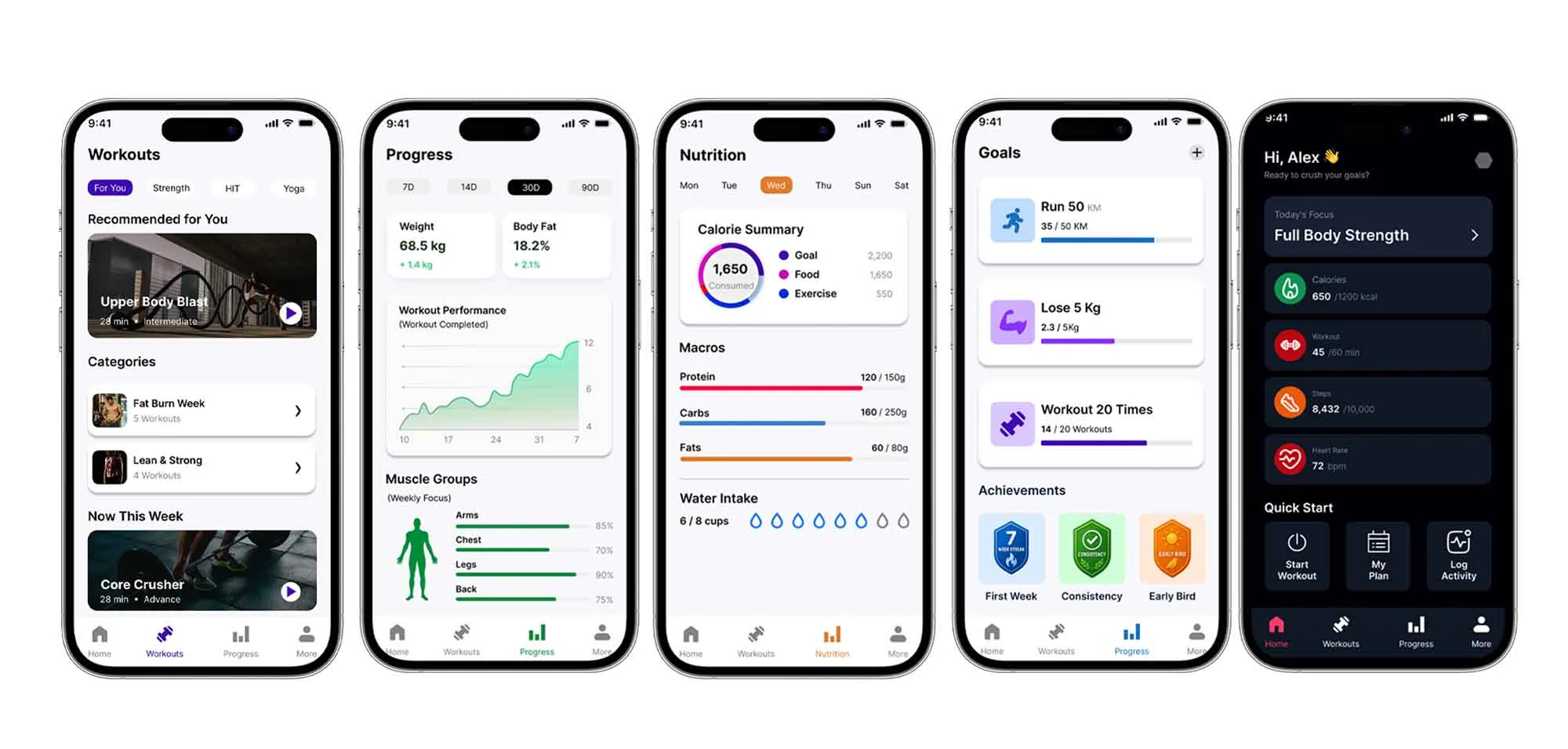
After client research, I found that users need 5 core screens: Home Dashboard, Workouts, Nutrition, Goals, and Progress. I focused on making each screen powerful but not overwhelming.
Possible Solutions
Combine workout library + nutrition tracking + goal setting + progress analytics into one app. Use a dark premium UI with color coded data (green for progress, purple for CTAs, orange for nutrition) to make information easy to scan at a glance.
7. Final Designs (Mockups)
8. Design System / Style Guide
Typography
Inter - bold for headings, regular for data labels.
Colors
- Deep dark background (primary)
- Purple accent (#7B2FBE) for CTAs
- Green for progress data
- Orange for nutrition indicators
- White for primary text
9. Conclusion
The main challenge was designing 5 data heavy screens that still feel clean and not overwhelming. The outcome was a dark premium UI with color coded data sections, making it easy for users to scan their fitness at a glance. I learned how to balance information density with visual breathing room in dashboard design.
10. Scope of Improvements
Wearable Integration
Connect with Apple Watch or Fitbit to auto log heart rate and steps without manual input.
AI Workout Recommendation
Based on the user's progress data, suggest the next best workout automatically.