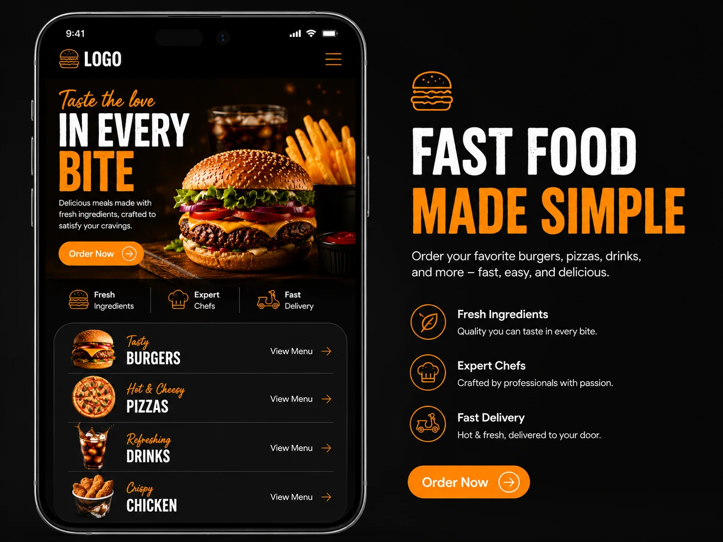
1. Context
I designed a fast food restaurant website with a dark, premium feel. The goal was to make the brand look high quality while keeping ordering and table booking easily accessible from the homepage.
2. Problem Statement
Most local fast food websites look cheap or outdated, which reduces customer trust. There was no clean way to browse the menu, book a table, or explore event catering services in one place.
3. Project Overview
My Role & Team
Zeeshan Ahmed — UI/UX Designer
Duration
2 Weeks
Tools
- Figma
4. Project Goal
Design a modern restaurant landing page that drives two main actions — Book a Table and Explore Menu — while also showcasing event services and building trust through reviews.
5. Research & Persona
Persona
Profile: Food lover aged 20–35, browses on mobile and desktop, makes dining decisions based on visuals and reviews.
Pain Points:
- Can't find menu or pricing quickly
- No easy way to book a table online
- Website doesn't reflect the quality of the food
Competitive Analysis
Premium restaurant brands like Nando's and Shake Shack use dark themes with food photography to build appetite appeal. Local competitors use plain white layouts with poor imagery — leaving a clear gap for a visually premium local brand.
6. Brainstorming & Ideation
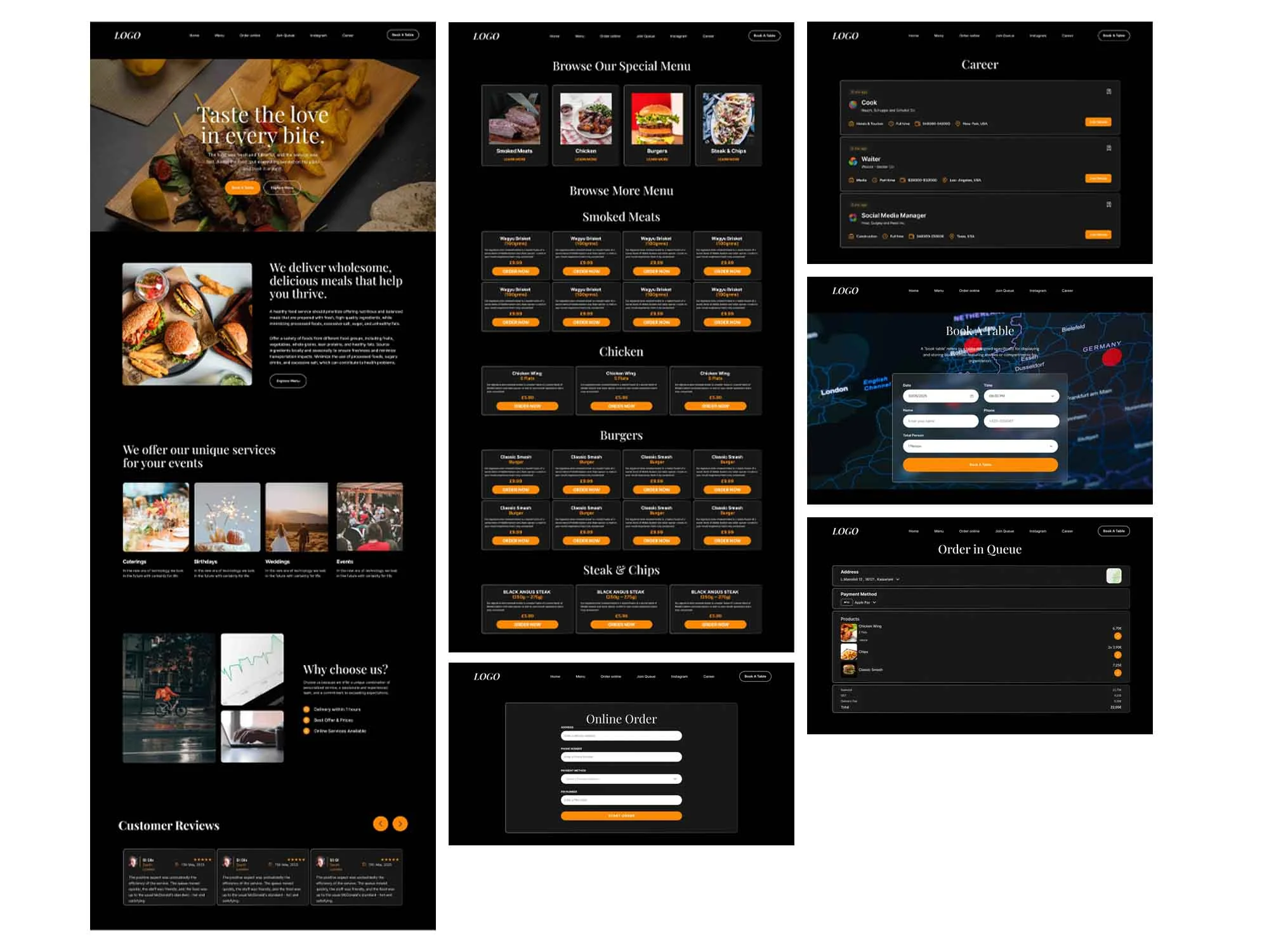
I used a dark background throughout to make food photography pop. Sections flow from hero → about → services → why us → reviews guiding the user from brand impression to conversion naturally.
7. Final Design (Mockup)
8. Design System
Colors
Pure black #000000 background, warm amber/orange for CTAs and bullet accents, white for headings, light gray for body text.
Typography
Elegant serif for hero heading "Taste the love in every bite", clean sans-serif for nav and body text.
Components
Full-width hero with dual CTA buttons, image + text split section, 4-column service cards, bento-style "Why Choose Us" grid, customer review carousel with navigation arrows.
9. Conclusion
The main challenge was making a fast food brand feel premium without losing its approachability. The dark theme with warm amber accents solved this — it feels high-end but still warm and inviting. I learned how food photography placement directly impacts how trustworthy and appetizing a brand feels online.
10. Scope of Improvements
Online Order Flow
Add a full menu page with cart functionality for direct ordering.
Mobile Optimization
Redesign the layout specifically for mobile since most food decisions happen on a phone.