1. Context
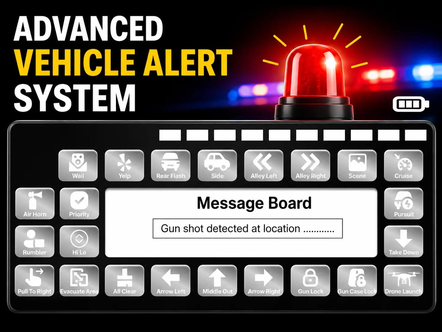
I designed a Police Car in-vehicle control panel screen. The goal was to give officers instant one-tap access to siren modes, light patterns, tactical signals, and emergency messages directly from their car's dashboard screen.
2. Problem Statement
Officers inside a moving vehicle need to control sirens, lights, and send emergency messages without taking their eyes off the road for too long. Current systems are cluttered, hard to read at a glance, and not optimized for in-car display screens.
3. Project Overview
My Role & Team
Zeeshan Ahmed — UI/UX Designer
Duration
3 Weeks
Tools
- Figma
4. Project Goal
Design a single-screen in-car control panel that groups siren modes, light directions, tactical actions, and a live message board all accessible with one tap, optimized for a wide landscape car screen.
5. Research & Persona
Persona
Profile: Active duty police officer, age 25–45, operating inside a patrol vehicle during emergency or pursuit situations.
Pain Points:
- Must react in seconds during high-stress situations
- Bright sunlight and night conditions both affect screen readability
- Complex multi-screen systems slow down response time
Competitive Analysis
Traditional in-car police systems like Whelen and Federal Signal use physical buttons and knobs. Moving to a digital screen requires keeping that same muscle-memory familiarity large tap targets, clear icons, and logical grouping by function.
6. Brainstorming & Ideation
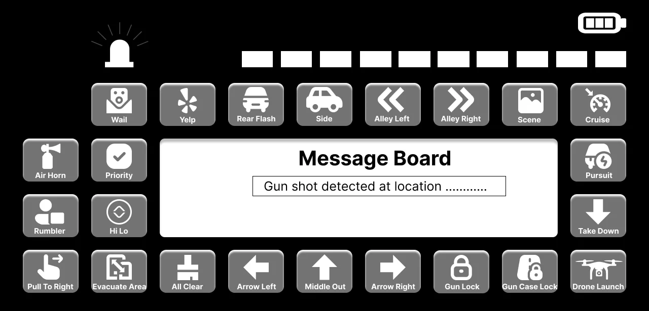
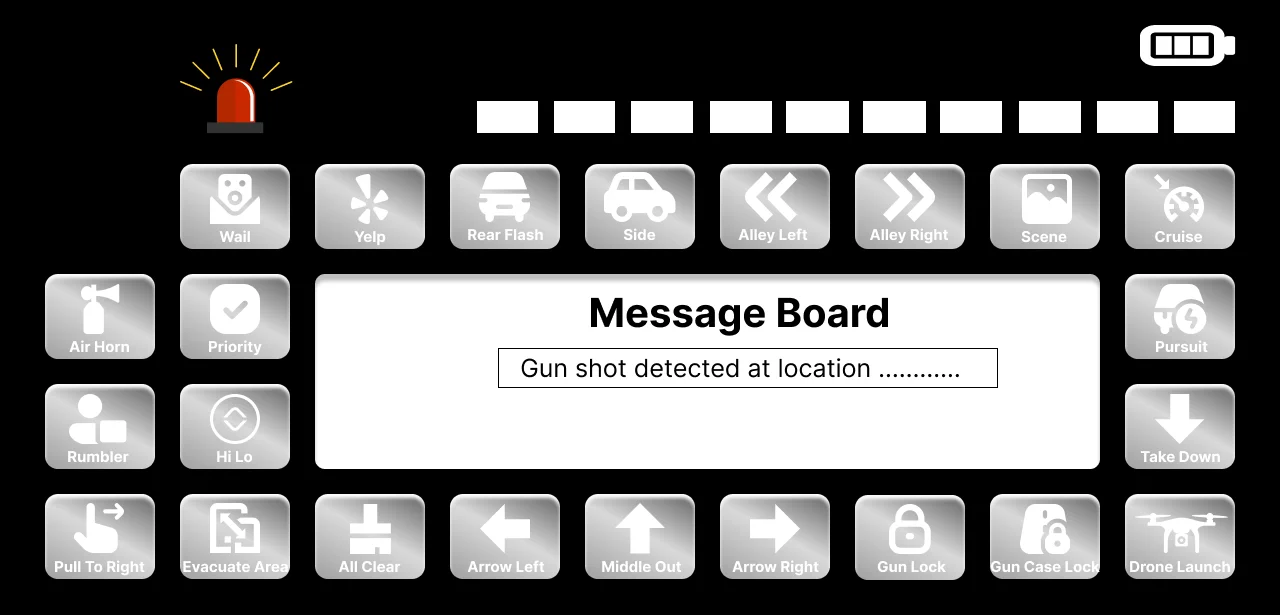
I grouped controls by use case siren sounds (Wail, Yelp, Hi Lo) on the left, light directions (Rear Flash, Side, Alley Left/Right) on top, tactical actions (Pull To Right, Evacuation, Arrow directions) on the bottom, and the message board centered for active communication.
7. Wireframes
8. Final Design (Mockup)
9. Design System
Colors
Pure black #000000 background for day/night visibility, metallic silver buttons, white icons and labels, red siren alert accent.
Typography
Bold sans-serif for Message Board heading, small white regular for button labels.
Components
Rounded square metallic icon buttons, top light indicator strip, center message board with input field, battery indicator, emergency siren icon.
10. Conclusion
The biggest challenge was fitting 20+ controls on one landscape screen without overwhelming the user. I solved this by using consistent icon + label buttons and grouping by function zone. Black background was chosen intentionally for maximum contrast in both sunlight and night driving conditions.
11. Scope of Improvements
Voice Activation
Hands-free triggering of siren and light modes during high-speed pursuit.
Customizable Button Layout
Let departments rearrange controls based on their specific workflow.